Sunday, July 24, 2011

Khalida.biz website - the making of.. part 3: Final design and functionality

To transform the webpages from the previous blog post to a more flexible design I had to make a few decisions.

First:
  • How wide did I want the pages to be? (answer: not too wide, I opted for 740px, fitting most phone browsers)
  • How could I make use of the available space and still display the pictures for each menu item? (answer: make the headers a bit longer and pull the pictures into the header)
  • If the backdrop was not going to be white, then which background color should I use?(answer: use colors similar to this blog :)
  • Where would I add the social media Icons? (in the header! now that there is more space..)
  • What would I have to change in the layout if I make the pages centered on the screen? (answer: not that much, the content section and text properties stay the same, but the layout of the page itself had to be adapted, which could all be done using a few modifications in .css)
  • All this did mean that the pages would get longer, so I had to add another row of menu items to the footer section of each page

I browsed the internet to see if I could find some examples of good websites using a centered design, but I did not find many that had the usability and simplicity that I liked in the original design. I did like the layout a lot of the new website of Orit Maftsir, created by the fabulous Sophie Armoza.

I asked Sophie and Orit if it would be okay to use some of the concepts she worked with (larger header design with name of the page integrated, separating lines for different sections.) The websites turned out to be quite different in atmosphere and general look in the end, but as I was so inspired by their work I added both Orit and Sophie to the website credits on my contact page.

Using a more centered design meant I had to adapt the .css file parameters and instead of using one background image I would need a background color and a header image for each page.

Creating the header images asked for some creative 'cutting and pasting', as I wanted it to match the new website background but also contain the picture, logo, motto, and the menu items on a bar matching the colors.

To do this I combined all the original images, added a background color gradient layer that was close to the background color I wanted to use for the rest of the page, added the name of the menu item and smushed the items together a bit so they would fit a more narrow selection, like so:


As you can maybe see I also added a layer of 'sparkle' to the bottom part of the header image, using a 'star' brush :) Now all I had to do was decide on the exact width of the header, create a selection of that width and then copy/paste that selection to a new image (using menu 'copy merged', creating this:


The same procedure was used for all other background pictures. All I had to do starting from the first header image was replace the picture, adapt the color of the menu bar and logo/text and add the name of the menu item in the header.

The Shop page header had to be a little bit wider:


To make the background not too 'flat' I opted for a background image for the page instead of a plain color, a general sandy 'pattern', and repeat it to make it fill whichever screen is used to view the page. This image is set in the .css file section 'body':

body {
   
background: url(images/background/image.jpg) repeat top left;

font: 7pt/14pt calibri;
color: #663300;
background-color: #ffffff;
   
text-align:center;
margin:0px;
padding:0px;
   
}

Result:


Next I needed a way to make the text more readable in the pages, without making the text area look too 'white'. After some searching on the web I discovered a way to do this by creating a 'semi transparent' .png image as the background for the text area.

In the .css file it looks like this:

#Container2
{

width:740px;
margin: 0px auto;
padding:0px;
text-align:left;
background: url(images/background/opaque.png) repeat top center;

}

Result:


And finally I needed to add the header image to the center section of the page:


#Container
{

width:740px;
margin: 0px auto;
margin-top:10px;
padding:0px;
text-align:left;

background: url(images/background/header_schedule.jpg) no-repeat top center;

}

 Result (with website content and social media icons already added)


The social media icons were easy to find, a simple search yielded many free and cheap downloadable icon images. Making the icons, menu items and main header clickable asked for some trickery though, for which I found some great online tips here. After that I created a favicon using part of the logo, added titles, content and images to the pages and that was that.


For the online shop I used 'Prestashop', a freeware solution that you can adapt (with lots of cursing ;) to your own website template and needs. It took me a while (including reading french forums) but am happy and proud of the result:

Whoop whoop :)

So, voilá, that's it, the making of www.khalida.biz :) Hope you found these articles helpful, would love to hear your own 'making of' stories as well so feel free to comment here or add links to your own blog!

xx Khalida

Khalida.biz website - the making of.. part 2: Background images and initial design

For this website there was an initial design that used the same pictures as the current site, but it looked quite different from the end result you can see now at www.khalida.biz

See one of the 'first design' pages here:


And the end result:

The original plan was to create pages that had a similar look and feel to the old khalida.biz website, but with a ligther background, matching the white backdrop that was used for the DVD recordings.

The background images were all composed of:
  • a white backdrop (easy peasy)
  • a picture from the new shoot (I selected 8 pictures in total, one for each main menu item)
  • the new logo (created for the DVD cover, adapted to the costume color of the pics)
  • a font for the 'motto' (I decided on 'Nuptial', which we also used for the wedding invitations :)
  • a flower brush (I bought a set of brushes to use in Photoshop CS3)
  • a menu bar, matching the color of the picture
  • menu text font (zapfino)
Each of these components had its own 'layer', which means they could be edited separately and copied to the other background files easily.

The backdrop was the easiest part, and because it was white the pictures did not need to be cut out very precisely, as they had a white backdrop as well. What I did instead was make a wide cutout of each background picture and soften the edges using the eraser tool with a blurry edge and large brush.


The logo was adapted to the colors of the main picture using a 'gradient overlay' effect and 'fancified' using the 'bevel and emboss' effect. I also added a drop shadow to give it a bit more depth.

The menu bar was created by selecting part of a new layer, giving it a solid color and then copying the  gradient overlay from the logo (its easier to copy and modify a gradient overlay in different pages then creating a straight-up gradient for each page)


The menu font I wanted to use for the website was Zapfino Linotype.

Normally I would just add the menu text in the .html file itself and specify the font name in the .css file like I did in my other websites, but alas it turned out that this font is not supported in all regular browsers, which meant I had to fake it by loading the font into Photoshop and adding the menu names as a separate layer in the background image instead.

For the picture galleries I used Simpleviewer, a free gallery program that I had some trouble with at first, but seems to be working better now. 


I was very excited with the end result (see above) so I immediately started creating the other background images and uploaded the new webpages to a test site after that. But, while testing these pages on different browsers and after showing them to my design buddy Sophie Armoza of Israel and to Eric from AzizaRaks productions the conclusion was that this design had a few drawbacks:
  • There were too many links in the top menu, making it too wide for viewing on most phones
  • A centered webpage would be more adaptable to different screen widths than a left-oriented one
  • The pictures next to the text did not always show up on a phone browser
  • The top section looked a bit 'empty', plus it could be used to link back to the home page, and/or host some social media icons that follow on each page (thank you Sophie for this one!)
  • The overall impression was that the pages looked nice and clean, but that they were 'too bright/white' for viewing comfort, and that the pictures with arms crossing the menu bar looked a bit strange setup-wise.
  • Not all information fit equally well on the pages, as I had used a set height for the text area which was perfect for wide screen computers but not so good for small laptops, notebooks and phones. Vertical scrollbars are not supported by all browsers. 

So.. Back to the drawing board for me! Thankfully a lot of the work previously done could be preserved.

What did I do next? Read more in the next blog entry :)

Khalida.biz website - the making of.. part 1: menu setup

Hi peeps! As promised, for the fellow web geeks :) here is a short rundown of how the new Khalida.biz website was designed and created.


First of all: the setup of this site is pretty simple, which was a very conscious decision, as the old website(s), (there was a separate one for the school) was becoming too hard to maintain in between traveling.

I started with mapping out the menu's and deciding on languages (only English for now) before creating the background and menu pages. To be able to embed the class information pages from the school website AND keep the pages themselves relatively narrow (ie: easier to read on phones) I had to work with sub-menus this time.

I also decided that I wanted to keep working with plain .html for the webpages and refer to .css files for the layout, as I did with my previous websites. This makes the pages themselves a bit easier to read and maintain.

For Khalida.biz the menu map looks something like this:

Index
Khalida
 Classes
 Schedule
Photos
Video
Contact
Shop

I wanted to use a different background/header for each of the main menu items, but keep the background the same for the sub-menus, so the setup above meant I that for the website design I needed 8 pictures, to create 8 backgrounds, each with their own .css file.

Every page would then link to the .css file with the correct background (for instance all the classes pages would use the same .css file 'purple_classes.css')


So, that's that, menu decisions were made, and I happened to have 8 pictures ready that I could use from the DVD Shoot in Montreal described in this blog post :)

In the next blog I will show you how I came to the actual design you now see on the website.

DVD update! Content listing and web shop link

Whoop, sent off both the Shimmy and Isis wings DVD contents and cover art to the printer company today, super exciting!

The main content timing for the shimmies DVD will be as follows:


Introduction: 1.21
Posture and warmup
  • Posture explanation: 01:42
  • Warmup to music: 05:05
Conditioning and stretches
  • Squats conditioning: 04:37
  • Standing stretches: 03:51
  • Seated shimmy drill: 05:57
  • Seated stretches: 04:16
Technique and exercises
  • Basic hip shimmy: 07:11
  • Egyptian shimmy: 06:45
  • Shiver shimmy/freeze:03:52
  • African shimmy/bounce: 01:28
  • Shoulder shimmy and hip twist: 05:16
  • Choochoo shimmy: 02:41
  • 3/4 shimmy 'up': 03:38
  • 3/4 shimmy 'down' 05:49
Extended shimmy drill: 21:09
Cooldown
  • Cool down: 04:38
  • Stretches: 09:24
+ Special features including 2 performances (one with Issam! woo!), pictures behind the scenes and an interview :)

And for the wings DVD


Introduction: 00:45
Concepts: 01:17
Posture and warmup
  • Posture: 01:27
  • Warm-up: 03:48
  • Upper body stretches: 03:55
Working with the wings
  • Putting the wings on + arm positions: 02:46
  • Discarding the wings: 01:15
Technique and combinations
  • Intros and poses: toga and envelope: 03:19
  • Intros and poses: mezdulene and majidah: 01:43
  • Intros and poses: hiding the wings: 02:18
  • Transitions and turns: turning tips: 05:22
  • Turn combination I: Lunge and 3-step: 04:01
  • Turn combination I: Kicks and chainés: 07:45
  • Spins and crescendos: Woosh and flip: 05:19
  • Spins and crescendos: Spinning variations: 06:00
  • Spins and crescendos: Barrel turns - technique: 04:28
  • Spins and crescendos: Barrel turns - with wings: 02:48
Freestyle dance-along: 07:49
Duo combinations
  • Mirroring and parallel: 05:37
  • Shadowing: 03:07
  • Back to back: 03:43
  • Stop and drop: 02:13
Cooldown: 05:16

+ Special features including 2 performances with wings and pictures behind the scenes :)

Squee!

PS: Linky that will take you directly to the webshop: www.khalidashop.bigcartel.com
pre-orders now available! shipping worldwide :) 

xx Khalida 

Sunday, July 17, 2011

Our webshop is now open - DVDs available for presales! :)

Hello all,

After months of DVD preparations and working on the web shop, we are now finally LIVE with www.khalidashop.com (Woohoo!) And this means: Starting NOW our webshop is officially OPEN which means you can start pre-ordering both brand-new instructional DVDs from there :) Yay!


Official release date for both DVDs is 15th of August 2011. Pre-ordering means that you will receive the DVDs at the earliest date possible, as they will be sent with the very first shipping batch, as soon as the printed DVDs arrive.

GOGOGO! :)

PS: Also check out the teaser trailer videos at:  

Enjoy! :)

Saturday, July 16, 2011

The making of.. Photoshoot DVD cover - behind the scenes :)

Hi all,

As promised, a 'making of' recap of the DVD cover photo shoot from this April.

The photographer we worked with was Rodolf Noël, from Montréal, CA, who also created Aziza's latest DVD cover and promotional pictures. The makeup-artist we invited had worked with both of them previously as well.

This was the first time for me to work with a complete 'team' for a photoshoot, and I have to say: The results were amazing :)

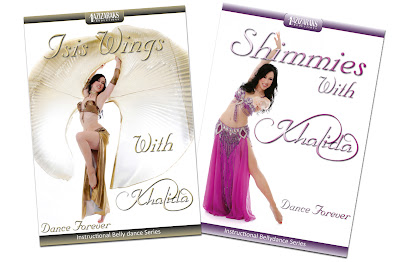
Here is a preview of the completed covers:

PS: Both DVDs are now available for pre-ordering at www.khalidashop.com!

But first of all, the preparations :) Photoshoots require some careful planning, so on advice from Aziza we bought some good-quality self-tanner a few days beforehand, and I made sure my nails were done the day before the shoot, drank plenty of water, and did some extra 'shred' workouts in the weeks leading up to the shoot ;)


We also made sure all costumes (two for each cover, and a spare just in case), jewelry, props (veil, wings) plus makeup were neatly packed and prepared.

Hair (best trimmed and colored a few weeks before the shoot!) was prepared with a volume shampoo (like 'Big' from lush cosmetics), volumizing spray (from John Frieda), careful brushing and then hot rollers in the morning, which had to stay in all the way to the studio and even during makeup, as you can see :)

For this day we had a few 'missions', first we needed some 'casual' shots with natural makeup and hair for the back cover of both the Shimmies and the Isis wings DVD. For each of the covers we used a different shirt (blue for shimmies, white for wings) and makeup was adapted accordingly.


All shots were done at the photographers' home studio with a white backdrop to match the clean background used in the DVD, and lights were setup on both sides to make the pictures 'pop'.


The end result: Serious Khalida! :)


Our second 'mission' was to get a good promotional shot for the front cover of the Shimmies DVD. For this part of the shoot we used 2 costumes, fuchsia and purple, which meant makeup and hair had to be adapted accordingly. We opted for eye shadow and lip gloss in the same shades as the fuchsia costume first, and my hair was 'fluffed' a bit at the crown to give it more volume.


The poses we used for the Shimmies cover had to be 'long', to make sure they would cover enough of the DVD area. In the end we chose the picture with one leg out to the side, because it created a nice diagonal line around which the logo and DVD title could be arranged more easily.
Next up was the Wings DVD. For the cover the costumes would be copper and gold, so the eyes, lips and cheeks had to be adapted to match. Plus more hair fluffing!


The makeup artist used mac eye shadow in copper tones and black liner all the way around my eyes this time around, and a lipgloss mix that matched the costume perfectly. A few extra layers of mascara were added (no fake lashes!) and the result looked like this.


For the wings pictures we had to do a small 'crash test' first, to see if we had enough space for the poses without smashing the lights or stereo system. As it happened, that very first test picture made a good cover candidate too.. Quote the photographer: 'Tabarnac!' ;)


Our favorite picture pose for the Wings DVD was the following one, which turned out to be even slightly more spectacular than the 'test' shots :) Plus the circle of the wings made a very nice match to the shape of the DVD label.

After that we did a few 'bonus' pictures with a new costume as well as portraits to use as background pictures on the new homepage and promo material. For this we chose the second wings costume, by Asi Haskal of Israel. Eye makeup stayed mostly the same, only the lip gloss color and jewelry were adapted.


Mission(s) achieved! We concluded the shoot right on planning with some well-deserved snacks and a final pose with the photographer himself.


All in all it was an amazing experience, and I feel very lucky to have been able to work with such a great team. Aziza was there as well the whole day, giving moral support and great tips on posing and styling, and Eric was our 'back stage photographer and manager', he assembled the team for the photo shoot as well as for the actual DVD recordings and he took great pictures of the picture-taking and preparations along the way :)

Check out all currently available DVDs at www.khalidance.com/DVD